Design + Consulting Studio

Mood

Posts in ARI Projects
Modern Farmhouse Magazine
Screen Shot 2018-07-10 at 8.40.37 AM.png

So exciting! Check out the latest issue of Modern Farmhouse on stands now to see the stunning 6 page spread of a beautiful kitchen remodel that we contributed to. The truth is great designs are usually due to a great home owner and this project was no exception. This project came out so beautifully because Lisa has amazing personal style and had a very clear vision of what she wanted for her home and it is truly a reflection of her. 

This particular project was so awesome because so many talented people were part of it! See all the details here

Gray Malin Before and After

Always on the road! I just got back from an amazing shoot from our newest Sonder property in New Orleans. I cannot wait to show you guys! While I was away a design that I did a few months back for the photographer Gray Malin came out and I am so thrilled about it! Gray has such a fun and distinct personal style that I was really excited about the prospect of creating a space that reflected him and his lifestyle. 

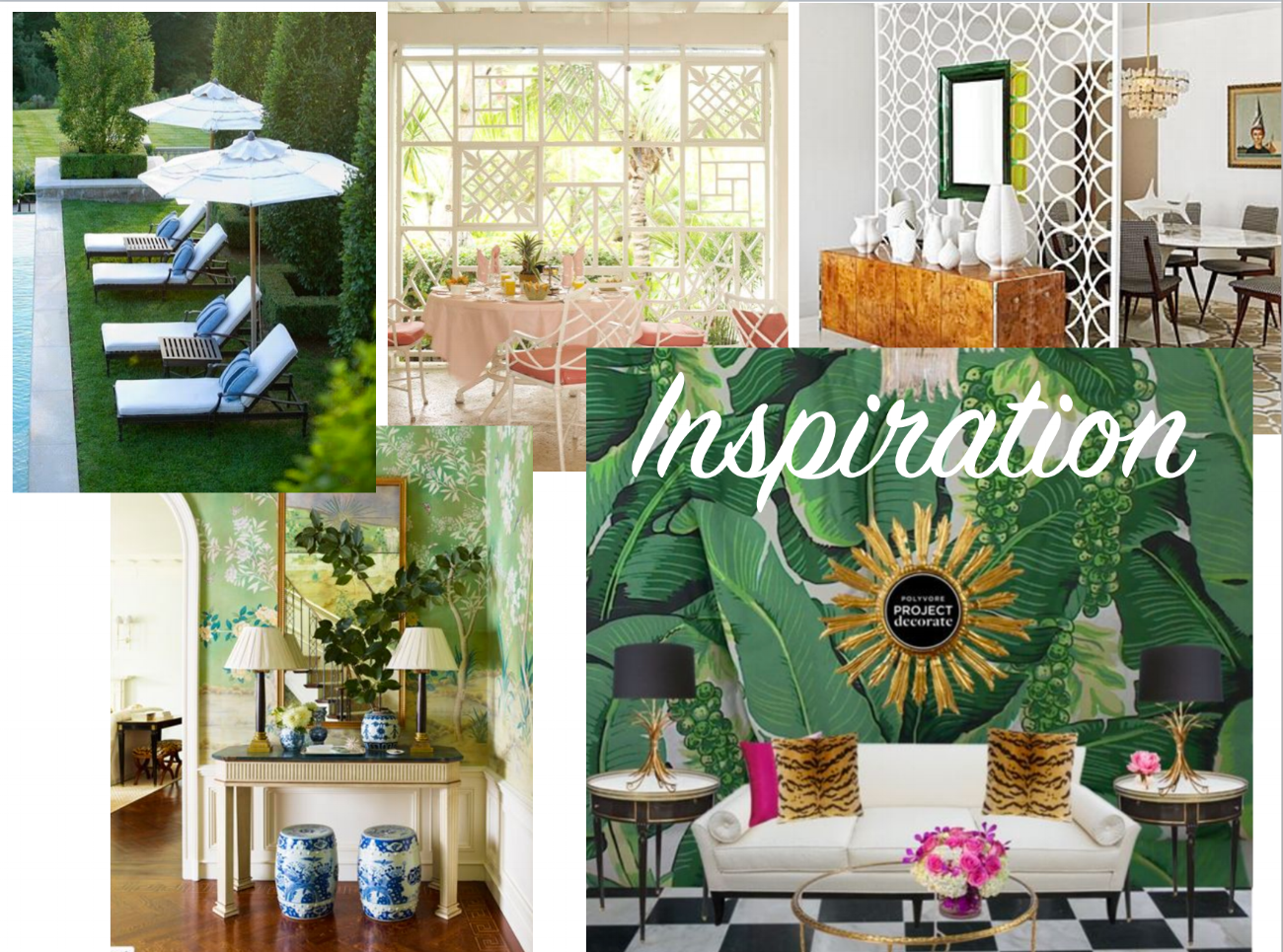
Gray had a very specific idea of what he wanted for the space, so we started out with his inspiration board. It was a mix between Palm Springs and mid century. I was off and running! 

BEFORE 

BEFORE 

The space was just a typical garage filled with lots of stuff! We did some cleaning of the space and then go started with the design. Luckily Gray loved most of the design that I came up with so the design process was very quick! Gray really wanted the space to be multi functional- a guest space, a hang out space for next to the pool, a work area. And I think we got it all! See yhe whole reveal here and also on Gray's site here

Time for a swim! 

Welcome to the Tiny Tree House!

I am so excited to finally unveil my "Tiny Treehouse!"  I have always been the designer that focuses more on other people's homes than my own, so when I found my perfect house I was so excited to really make it mine. 

47 stairs up above the trees- my little cabin in the sky is the perfect spot for me to feel inspired and rejuvenated. I have filled it with all my favorite bohemian pieces- frazadas, mudcloth, vintage moroccan rugs and a whole lot of woven rattan and carved wood. I guess I was inspired by my 70's fireplace that is the center of attention in my living room! 

Take the full tour over on Apartment Therapy and read my interview on what inspired my design! And thank you so much to the fabulous Julia Sperling for your impeccable eye and making my tiny tree house shine! xx

Before and After: Erin Heimstra of Apartment 34

So excited to reveal this one! Recently I completed the design for the guest bedroom of the talented Erin Heimstra from Apartment 34. I have been so lucky lately working with so many talented ladies with a great eye for style- it really makes the collaboration process that much more fun. And it always ups the challenge to create a fashionable, stylish space when the client is so fashionable and stylish herself! 

before

before

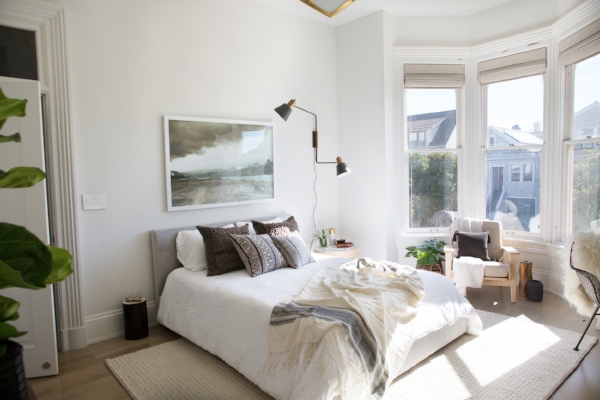
Erin recently completed the remodel of an old Victorian here in San Francisco and let me just say this house is AMAZING! I am happy to say the guest room/ home office is the first room in Erin's "Old Victorian" to be completed and I am pretty happy with the results! 

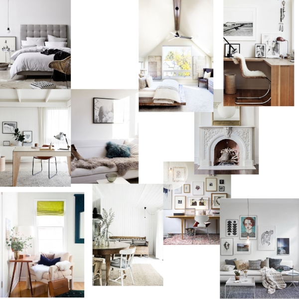
Erin loves white and clean-  her inspiration was a little Scandinavian, a little Parisian loft. She really wanted the space to have an easy feel and I played off of that to create  a room that was not too feminine and not too masculine. 

Leaning pictures, an industrial sconce and clean white bedding all play into the look creating a luxurious respite for guests and also a great place for Erin to spend her days working. You can read ore about the design on Architectural Digest and read more about the project! 

Art On My Walls Part I-- How to Display

Art is such an important aspect to any design project. Art can set the tone of a space- it can completely transform the vibe of a room based on the subject, the color and the way you display it. Its always amazing to me the way adding a simple art piece to the wall or combining things together in a gallery wall can totally change the direction of a design. There are so many great artists out there, and discovering new artists is never ending- so I figured I would break up this subject into 2 blog posts, how to display and my favorite sources (I have a lot!). 

Gallery walls will never go out of style. I promise! Its a great way to combine multiple styles and sizes to create an impactful focal statement in a space. I created the gallery wall above in the Decorist office and it was such an inexpensive and one of kind option. I went on a little buying trip to one my favorite local vintage shops and sourced some cool abstract art pieces and displayed them above a vintage credenza. Instant gallery wall! 

For me gallery walls are great because I have a knack for collecting odd and mismatched pieces for the wall- tassels, horns, convex mirrors are some of my latest finds, so creating unique gallery walls mixed with my latest favorite artists is a great way to keep the space fresh and rotate my ever growing art collection. I created this fun gallery wall for San Francisco advertising agency Partners in Crime because my client also loved art and wanted a way to display his amazing walking sticks from the Mill Valley Walking Stick Company that he creates (more on my favorite art sources coming up!) 

So besides gallery walls how else do you display art? Don't restrict yourself just to displaying art on the walls. I love the idea of over-laying art on bookshelves or on other built in architectural elements. It immediately adds depth and unexpected interest in a room. 

Leaning art is another favorite of mine. Its feels so casual and sophisticated and has an easy Parisian flair to it. Best part is no nails in the wall so if you are a crazy art collector like me. you can easily change out without feeling like its too permanent.

So thats the skinny on how I like to display my art, stay tuned for some of my favorite (current) art resources! 

credits: Hollywood Hills/  Decorist/ Union Street / Prospect Street 

Before and After: Audrina Patridge's Living Room

Audrina and I had so much fun re-designing her bedroom that we were pumped to jump in and start on our next project- the combined living room, dining room and kitchen. Audrina initially started out on her new home re-design with her master bedroom because she was just about to have new baby Kirra and really wanted a place to be cozy and to nest. She soon realized that she was spending most of her time with her family and the new baby in their great room and really wanted to get that space as shaped up as we got her bedroom! 

First thing first, inspo! Audrina sent me lots of great inspiration pictures for what she was hoping to achieve in the space, lucky for me I already had a good idea of what she was wanting- Boho/ Bali/Beach, functional, luxurious, tropical, pattern infused. I had also already been privy to her closet and how she likes to inadvertently match her shirts to her lamps (insert smiley face) so I was pretty clear on the design direction! 

Before

Before

Before

Before

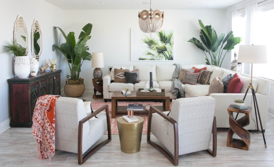
Keeping her existing sectional, Audrina and I set about creating a comfortable, space for the family to hang out. One of the  major changes to the room layout was the shift of the sofa to face into the space. I really wanted to open up the space so that whoever was cooking in the kitchen could still feel connected to the rest of the space and vice-versa. Two low slung chairs with a subtle printed mudcloth provide additional seating and add that bohemian flair we were trying to bring to the space. I absolutely love the beaded chandelier it is definitely the glamorous, bohemian show stopper that we needed for Audrina's space! 

Audrina is such a great client, I love working with her because she has a great sense of style and really know what she likes! I think the space is a reflection of that and of her -  It feels so functional and cozy, but also designed and pulled together. Check out the articles in People and Architectural Digest and be sure to hop over to Audrina's blog to find out where all the pieces are from! 

Photography Credit: Carla Choy Photography