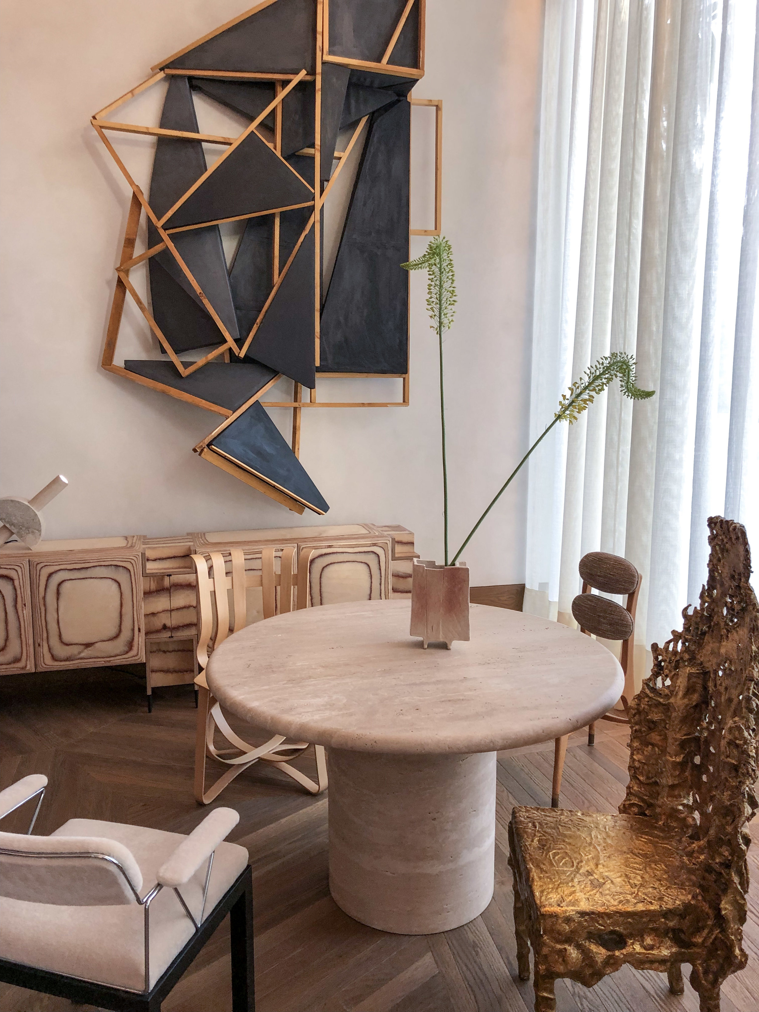
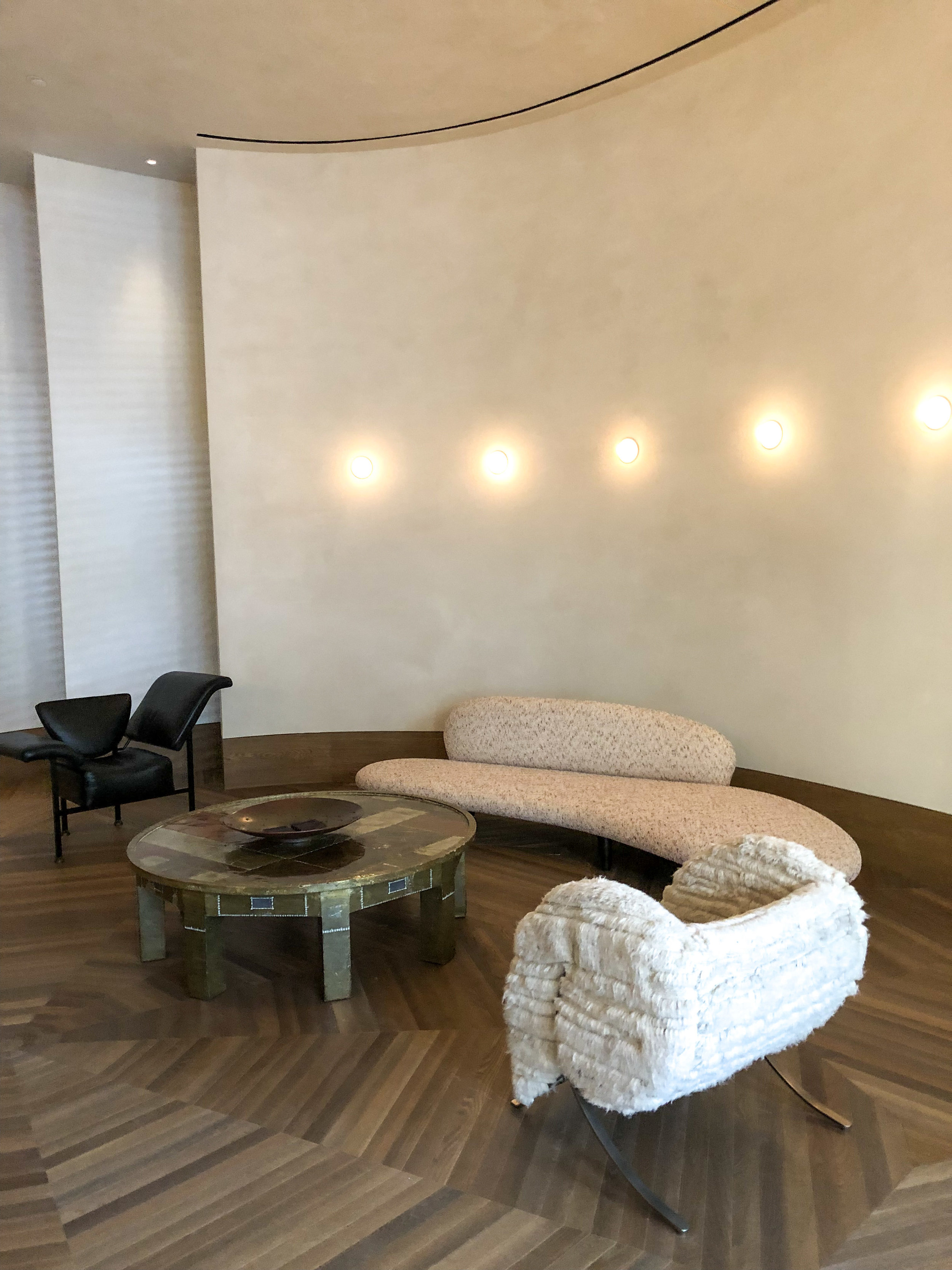
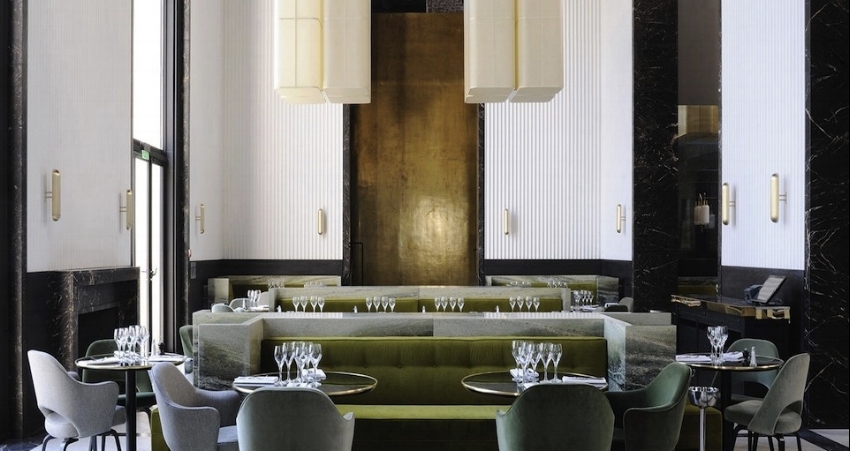
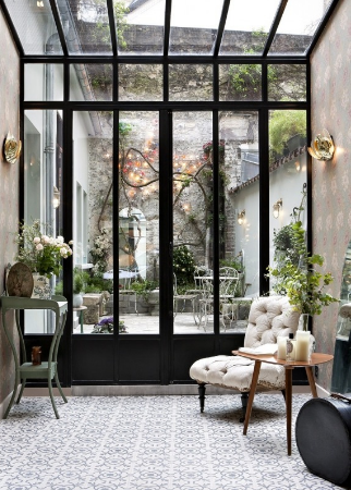
The latest and greatest from one of my favorite designers Kelly Wearstler. Of course I had to come up with an excuse to go visit and stay in the new Proper Santa Monica Hotel, a meeting in Santa Monica gave me the perfect reason to escape!
The whole space is beautifully curated and feels at once luxe, but attainable. Otherworldly sculptural furniture elements mix with natural, simple materials making for a dynamic and eye pleasing combination. I spent more time then I want to admit walking through the lobby and restaurant taking in the wood and upholstery choices and eyeing each light fixture and hard surface choice. It feels both wild and restrained which is a difficult combination to reach.
While The Proper San Francisco is a whirlwind of pattern and color choices, with jewel tones and blacks contrasting each other, The Proper Santa Monica feels quieter, simpler. You can feel the inspiration of nature, beach sands and organic materials guiding each choice. The underlying vibe is still sexy and sleek, but with a different note this time.
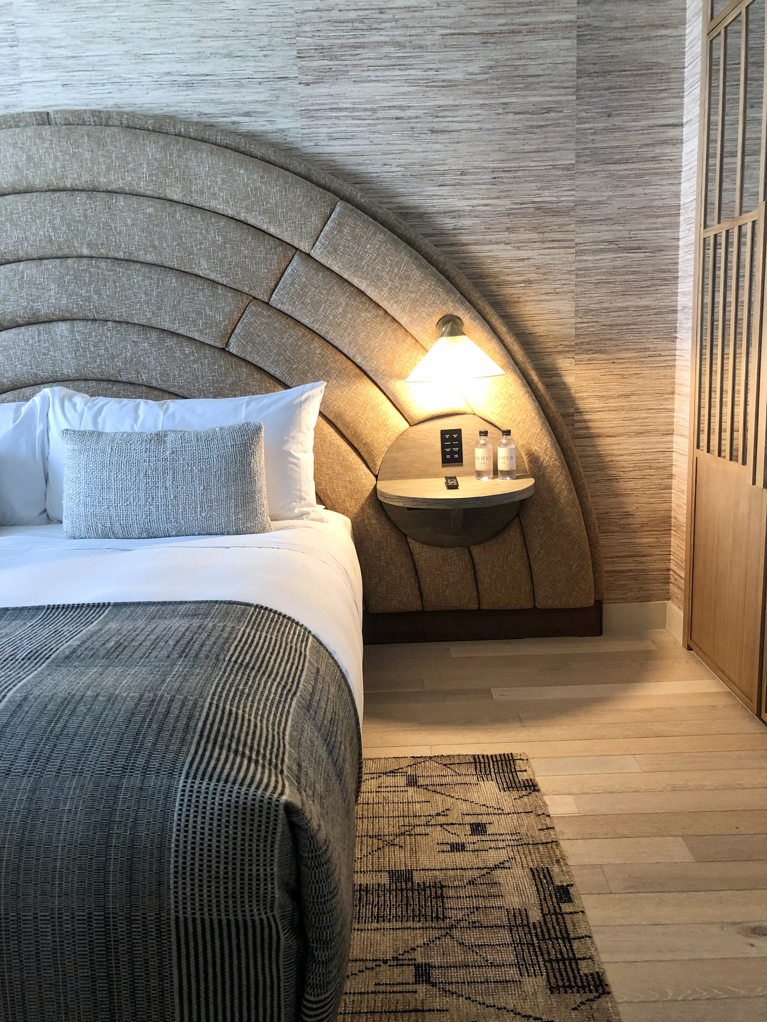
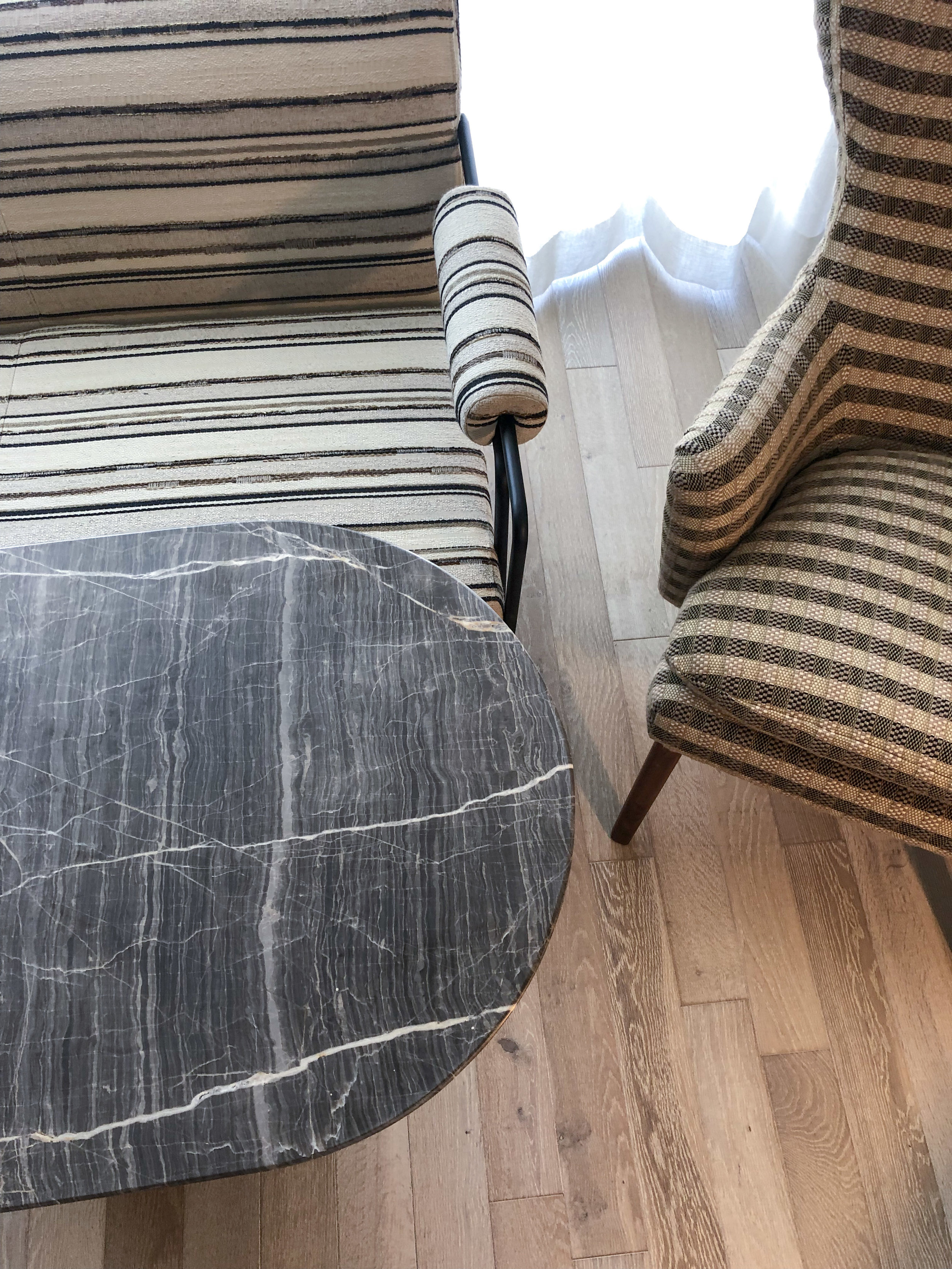
After dinner and a beach walk, I found myself back in my room excavating each surface and material choice. Wide plank light oak floors lay the natural palette while each furniture item is curved, no right angles in sight. An interesting choice, but something I have seen recently trending in furniture styles- more curves and soft lines than ever before. This sets an unconsciously soft and soothing sense to the space. The oversized, half moon shaped upholstered headboard makes you feel secluded and encapsulated in softness. The quality of all the materials is obvious and felt throughout- solid woods, rich wools, simple linens.
Overall I loved my stay, and felt comfortable and relaxed. The environment was perfect for a quick working getaway and reminded me once again of the power of a beautiful interior. The impacts of beautiful spaces are so profound and can trigger inspiration when you least expect it. Thanks Kelly for another beautiful space to inspire!
1/

