Design + Consulting Studio

Mood

Black and White All Over

You can never really go wrong with monochromatic styling. It always feels fresh and modern and its a great way to keep a design gender neutral in an interior. Same goes for apparel, I love the look of all one color top to bottom. One of my clients that I am currently working with loves working in single tones and her spaces are so sophisticated and clean. 

Even though you are building on just a few tones keep it interesting by: 

+ invite texture- select fabrics and materials that add depth to the design even in one tone. Bring in leathers, knits, velvets. Even all in black each of these materials will look utterly different in the space. 

+ pattern play- think about what patterns you can bring in that will compliment the design while keeping in tune with the colors that you are using 

+ material mash up- adding acrylic, glass, silver, gold will do wonders to add dimension to your monochromatic look. All of these materials play well with the tone on tone look and dont take away from the clean look you are after. 

Ok off to go put my glass heeled booties on (sigh) and put up some of that amazing Kelly Wearstler wallpaper (double sigh)....

images via: Le Fashion   The Design Chaser Totokaelo Kelly Wearstler Ferreol Babin 

Ashley Redmond
Obsessed with

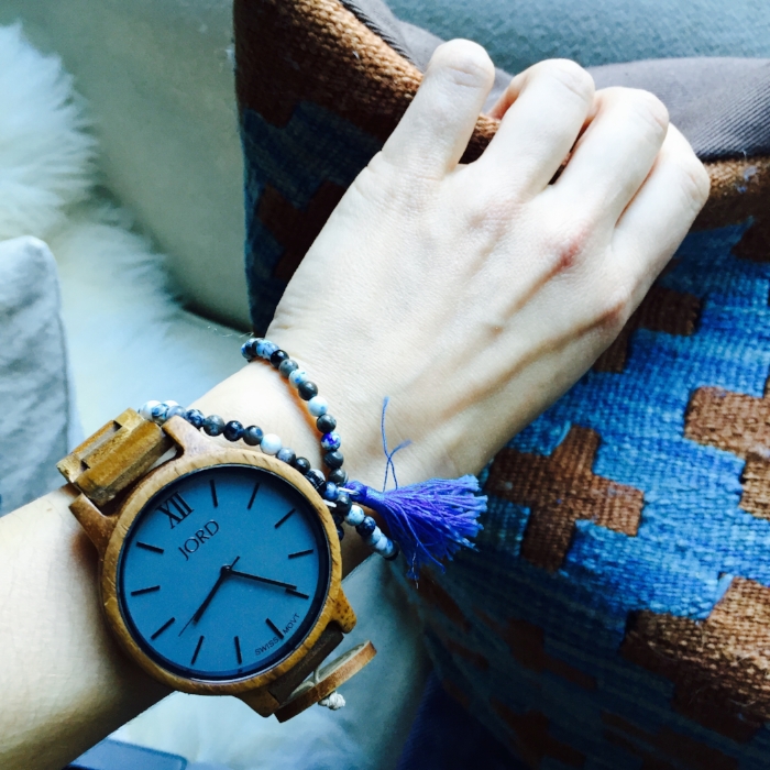
My Jord Wood Watch! I have always been a  watch freak- I have a thing with bracelets and unique watches, I guess its because I'm such a visual person that I love to look down and see something cool on my wrist! I am also all about function and am constantly on the go- running to meetings, catching flights, getting here and there that I am always in need of the time, so a watch is a must for my daily routine. 

I was introduced to Jord and immediately fell in love with the look and the construction of the watches. I am a lover of natural materials and the idea of a wood watch really appealed to me and my aesthetic. Its minimal and lightweight, but has an easy to read face and goes with everything! I have been sporting the Koa and Ash Frankie Watch lately and I love it layered with a funky beaded mala bracelet or any of my go to vintage silver cuffs. Easy and chic! 

Check out all the great styles here and best news yet-  Jord was kind enough to offer my readers a cool giveaway! Enter here to win e $75 e-voucher toward the purchase of a watch and guess what anyone who enters (excluding the winner) gets a $20 e-gift card. So everybody wins! Check them out and hopefully it keeps you from running late like me! 

This post was sponsored by Jord Wood Watches, all opinions are my own


Inspiration: Iowa

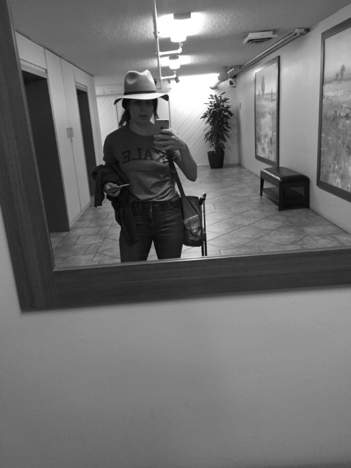
Traveling anywhere is a big source of inspiration for me. Whether its discovering a new coffee shop in my neighborhood or flying across the world- I love seeing what is popular, what design trends people are gravitating toward and what is different and what is similar in different parts of the country and world. Getting outside of my everyday routine inevitably triggers something creative and inspired in me.  Recently I spent a few days in Des Moines, Iowa for a photo shoot and on my down time I was able to get out and explore the city. We are just going to ignore the fact that it took me 16 hrs (lightning storms!) to get there! Adventures in travel! 

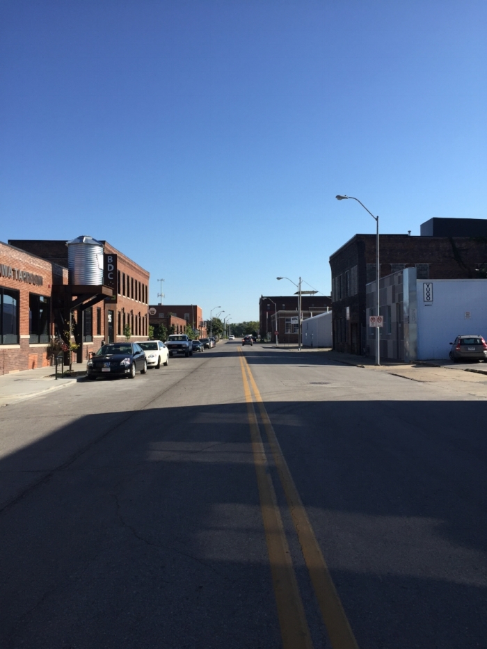
Des Moines, turns out is a great walkable city, I was able to get out in the morning and run along the river and check out the architecture and the skyline. The downtown is full of cool industrial style brick buildings with a thriving nightlife and great vintage fashion scene. Luckily I was pointed in the right direction by some of the locals I was working with and checked out Preservation. Mecca! Chock full of vintage levis, handmade shibori bags and delicate jewelry I knew I was in the right spot. The fact that the interior consisted of cool black and white rock and roll prints, rustic wood benches covered in sheepskin and layered jute and dhurrie rugs- well me and Preservation were pretty much kindred spirits. 

After a quick chai in a local cafe with a cool industrial, vintage vibe: concrete floors, buttery leather sofas and misc glass displays I grabbed my tea and took a walk over to the Des Moines Botanical Gardens. Ok we all know what a plant-a -holic I am, so this place was heavenly. An enormous dome overflowing with luscious greens, palms, banana leafs, pretty much any tropical green you can imagine and I was set. After taking this all in, I found myself along the river again coffee in hand, breathing in the thick humid air. 

Although it was a quick jaunt through, it was a great trip! I met so many creative people it was amazing- everyone was talking about their home improvement projects, what they were working on, what they were making. It was inspiring to be around so much positive creativity and it was an energy that was really tangible in the air. It was an electricity you could feel - or maybe it was just the humidity! 

I Want to Go: El Cosmico

It opens like this.. "El Cosmico is an 21 acre nomadic hotel and campground in Marfa, Texas. In keeping with the belief that life should be a balance of adventure and do-nothingness...." Count me in! So much is happening these days that I am ever more grateful for, but the idea of running away to a remote getaway with miles of stars and quiet is always so appealing. Of course funky design, sunset soundtracks and camp cooking are just the extra pieces to get me to pack a bag and jump on a plane to wide open Texas. 

Trailers, teepees, yurts and tents dot this property inspired by "hippies, nomads, bohemians and those living a life of self-determination." Its the perfect spot to tune in and get centered. 

Follow along on my Wander pinterest board for a little reminder to breathe in the air and look around at all the beauty. 

all  images via El Cosmico

Before and After: Audrina Patridge's Living Room

Audrina and I had so much fun re-designing her bedroom that we were pumped to jump in and start on our next project- the combined living room, dining room and kitchen. Audrina initially started out on her new home re-design with her master bedroom because she was just about to have new baby Kirra and really wanted a place to be cozy and to nest. She soon realized that she was spending most of her time with her family and the new baby in their great room and really wanted to get that space as shaped up as we got her bedroom! 

First thing first, inspo! Audrina sent me lots of great inspiration pictures for what she was hoping to achieve in the space, lucky for me I already had a good idea of what she was wanting- Boho/ Bali/Beach, functional, luxurious, tropical, pattern infused. I had also already been privy to her closet and how she likes to inadvertently match her shirts to her lamps (insert smiley face) so I was pretty clear on the design direction! 

Before

Before

Before

Before

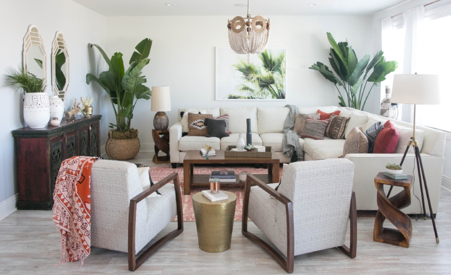
Keeping her existing sectional, Audrina and I set about creating a comfortable, space for the family to hang out. One of the  major changes to the room layout was the shift of the sofa to face into the space. I really wanted to open up the space so that whoever was cooking in the kitchen could still feel connected to the rest of the space and vice-versa. Two low slung chairs with a subtle printed mudcloth provide additional seating and add that bohemian flair we were trying to bring to the space. I absolutely love the beaded chandelier it is definitely the glamorous, bohemian show stopper that we needed for Audrina's space! 

Audrina is such a great client, I love working with her because she has a great sense of style and really know what she likes! I think the space is a reflection of that and of her -  It feels so functional and cozy, but also designed and pulled together. Check out the articles in People and Architectural Digest and be sure to hop over to Audrina's blog to find out where all the pieces are from! 

Photography Credit: Carla Choy Photography

Project: Living Room Design for Kyla @ House of Hipsters

I always say that the most important part of the success of a design project (and what happens to be my favorite part of being an interior designer) is the connection between the designer and the client. This couldn't be more evident than in the case of the design that I created for my virtual bff Kyla Herbes from House of Hipsters. First of all, this is the second time that Kyla and I have worked together. We first "met" when I did the design of her guest bedroom and really met when she flew out to the Seattle Showhouse and I was able to give her a tour around the house. When her and her family moved to their new home it was the perfect opportunity to collaborate again! 

Let me start by saying that Kyla is an amazing designer and stylist in her own right and I said more than once during the course of our working together "you totally dont need me!" But I think the fact that we both love the collaboration process so much and bouncing design ideas off of each other is what keeps us going! The amount of times that she has purchased a piece of art that I own, or emailed me saying "hey do you like this" and I literally just picked out the exact same item for another client is so many its spooky! 

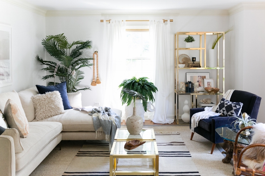
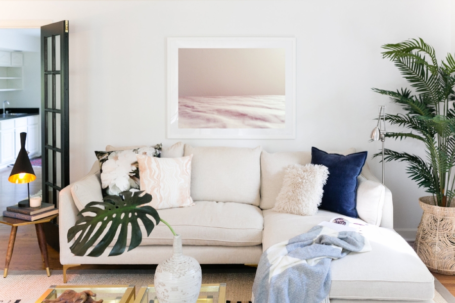
Now lets get to the room! This space is the first area that you enter into when you come through the front door- its more of a "formal living room" so I wanted to dress it up a bit, but also make it ultra accessible for Kyla's family. I imagined Kyla having a cup of coffee or her kids jumping on the sofa in the space. I wanted it to feel welcoming but special. I think this was achieved by the mix of materials- shiny brass, organic woods and luxe velvets. I love mixing materials, textures, patterns and I think this room is the perfect example of how a layered room can feel so rich and have so much depth. 

Art is really important to me. I see interior design in itself as functional art- actually living in art, so bringing in special art pieces is really crucial to me and luckily equally important to Kyla. The piece from Tappan Collective is one of my favorites (I had spec'd this for another client and Kyla sent it to me asking me my thoughts on it- design brain connection!) and really sets the tone for the space. Its relaxing, ethereal, soft- everything I wanted this room to feel. The other art pieces are from Nicole Cohen  Kyla introduced this amazing photographer to me and I was instantly in love. She has so many beautiful pieces, go check it out!! 

So love this space, see all the details  here . its one my favorites, for one of my favorite people! So happy to be part of Kyla's new home and hey ready to tackle your other living room! Go check out the full reveal over on House of Hipsters, FYI the befores are pretty amazing!  xoxo

photo credit: Emilia Jane Photography

I Want to Go : Hotel Henriette

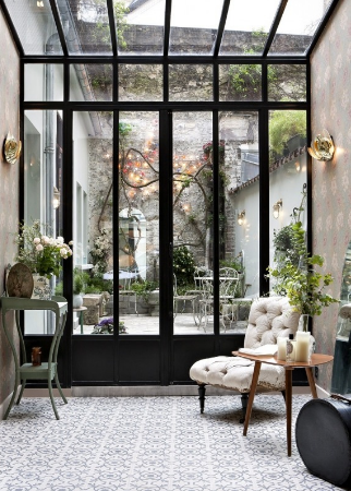
I'm headed to France next month and already planning for all the croissants I will be eating and museums I will be frequenting. I had enrolled in a beginner French class in preparation for my trip (and lets be honest my life) but sadly due to my crazy travel schedule criss crossing the US of late, I have missed every single lesson... So instead of buckling down with my Rosetta Stone I did what any design obsessed, newly minted Franco-phile would do, I turned to Pinterest for travel inspiration and immediately fell down the rabbit hole of all the places i would be finding treasures to bring home with me. 

So turns out I'm totally in love with Hotel Henriette in Paris. The rooms are to die for and don't you dare ask me which room is my favorite. I absolutely refuse to pick a favorite and I intend to switch rooms every night I am there. 

Follow along on my France Trip Board on Pinterest- I will be adding all the places I plan to visit! 

All images via Hotel Henriette